Feature Story
‘We Had to Get This Right’: How Johns Hopkins Built the Coronavirus Tracking Global Dashboard: An Oral History
Johns Hopkins APL joined the Johns Hopkins University COVID dashboard effort on January 27. This is the story of how the most trusted, accurate source of information available on the pandemic came to be, and how it became the data source relied upon globally for near-real-time tracking of the biggest health crisis this century.
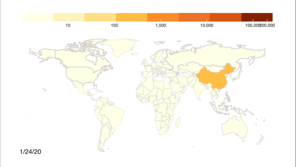
Rumblings of a mysterious new virus impacting the region of Wuhan, China, began making the news rounds in the U.S. starting in early 2020. At the time, the virus seemed like a distant worry — too far away to be of much concern to the American public, though perhaps something to keep an eye on. To almost everyone not involved in global health surveillance, the virus was nothing more than a blip in an endless news cycle. “Coronavirus” and “COVID-19” had not yet become part of the daily lexicon, and wearing a mask was an unfamiliar concept. Life continued, uninterrupted.
 But as January unfurled, the rumblings quickly increased to a fever pitch. The far-away worry became a real and present threat as COVID-19 reached the U.S.
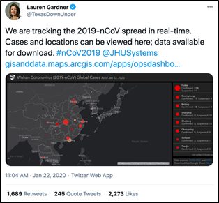
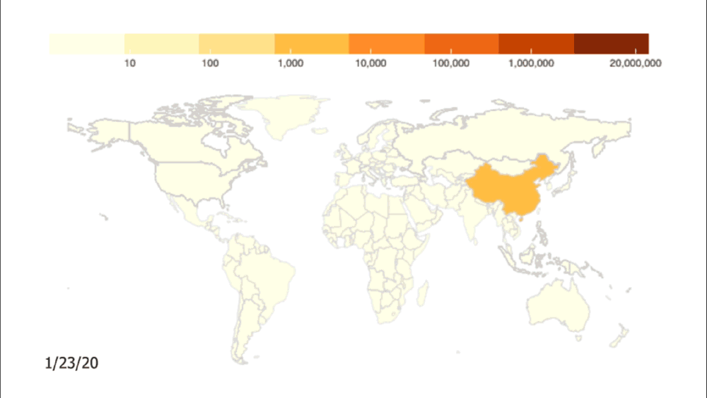
January 22: The first documented case of the virus in the U.S. was reported in Washington state. The next day, a small group of researchers, led by associate professor Lauren Gardner in Johns Hopkins University’s Whiting School of Engineering (WSE), unveiled a dashboard that allowed users to track global cases of COVID-19 in real time.
Gardner, who is also the co-director of the Center for Systems Science and Engineering (CSSE) at WSE, and her team of graduate students — some with family in China experiencing the pandemic firsthand — had been paying attention to the evolving situation since December 2019 and recognized the need for a simple way to track the rapidly spreading virus. The group began aggregating data via Google Sheets and rendered their findings onto a digital map; red dots marked the location and number of known COVID cases in a given region. The dashboard was easily accessible and readily available online.
As cases multiplied in the following weeks, so too did the number of users turning to the Hopkins dashboard, which quickly became the go-to source for the public, the news media and even the U.S. government. But the system’s early infrastructure buckled under the sheer proliferation of data as cases continued to explode worldwide. That’s when Gardner and her team turned to the Johns Hopkins Applied Physics Laboratory (APL) for help.
APL joined the COVID dashboard effort on Jan. 27. This is the story of how the most trusted, accurate source of information available on the pandemic came to be, and how it became the data source relied upon globally for near-real-time tracking of the biggest health crisis this century.
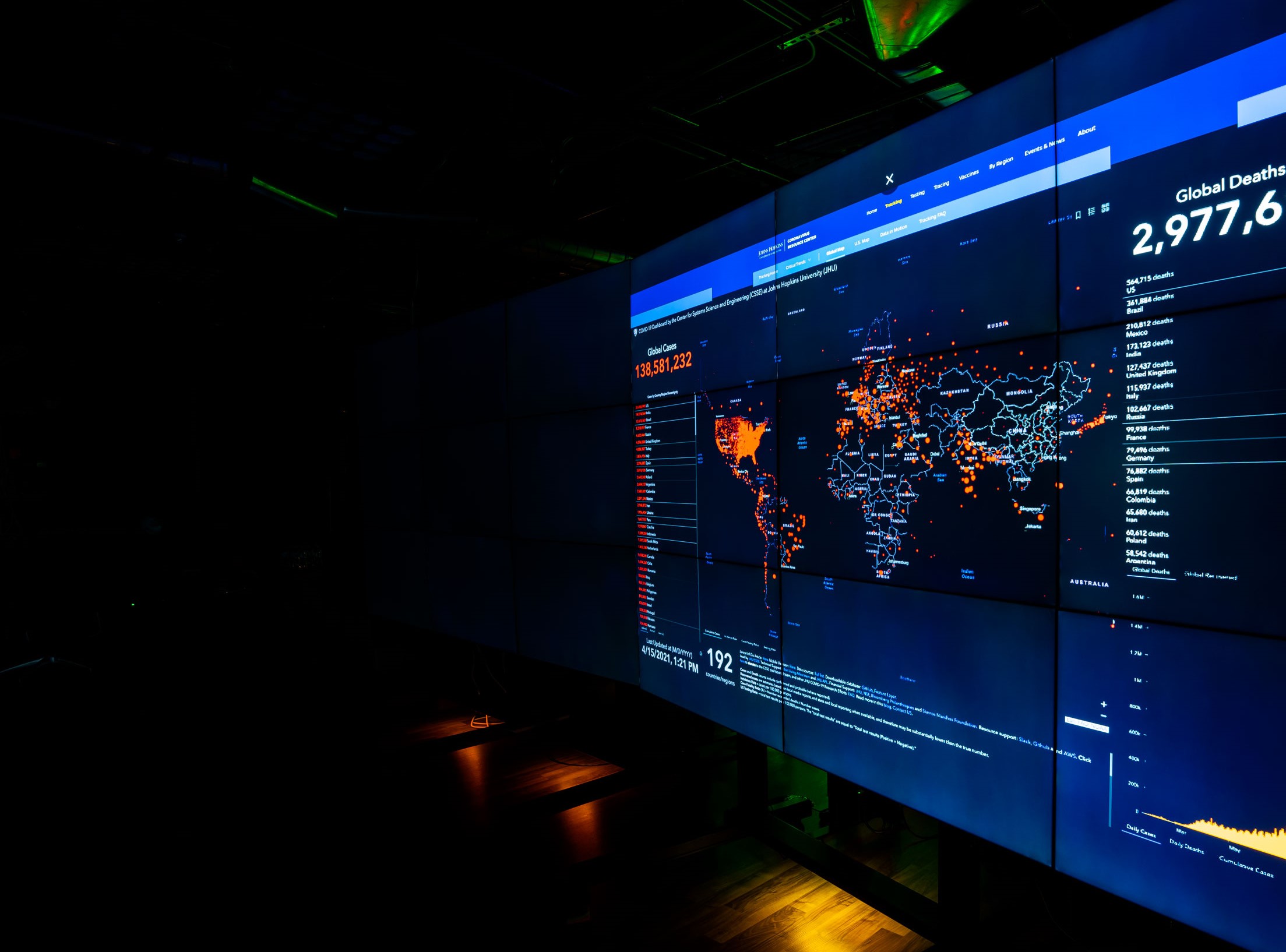
Credit: Johns Hopkins University Coronavirus Resource Center
Sheri Lewis, Health Protection and Assurance program area manager at APL: I called Lauren Gardner five days into this, roughly. We saw, of course, when the dashboard was initially stood up. And we quickly got a call from our sponsors at the Centers for Disease Control and Prevention (CDC), who support our disease surveillance efforts; they called one of our project managers and said, “Hey, we know this is a different part of Hopkins, but is there any influence you have over how they share the data?” When the dashboard first started, they were sharing the data in Google Sheets, and that is not something the federal government can download and use.
I picked up the phone to call Lauren because I thought that, in addition to making that suggestion, there was definitely going to be work that APL could do to support this. When I suggested, “Hey, I think APL can help you,” she was very interested in learning more.
Once COVID-19 had spread to every corner of the world, the flood of data was just too much to manage with manual collection and entry. That’s when our colleagues from the Applied Physics Lab stepped in.
Lauren Gardner, director, Center for Systems Science and Engineering, Johns Hopkins Whiting School of Engineering: The unexpected rapid growth of the pandemic drove an unexpected massive demand for the data — because there was nothing like it available yet. No one had tried to track a pandemic in real time with data from all over the world. It quickly became a resource for epidemiologists, elected officials, public health leaders, media and the general public around the world to track the outbreak as it was unfolding.
Once COVID-19 had spread to every corner of the world, the flood of data was just too much to manage with manual collection and entry. That’s when our colleagues from the Applied Physics Lab stepped in.
Lewis: At its fundamental core, the dashboard, and the larger project it would ultimately grow into (the Johns Hopkins Coronavirus Resource Center), is a health surveillance initiative. APL is an expert in understanding and using all kinds of data sources. When we stop and go back 20 years, and think about APL standing up ESSENCE (Electronic Surveillance System for the Early Notification of Community-based Epidemics), a disease surveillance tool, we were using anything we could get our hands on, any types of data. This was somewhat similar — while we were literally only looking at case-based data, it was still an issue of being able to take the data in whatever form it’s provided. That is a unique capability.
Lewis knew APL could help scale the system and streamline the influx of data. Not long after the dashboard was unveiled to the world, she connected with colleague Jeff Freeman, Prevention, Preparedness, and Response program manager at the Lab. Freeman heads up the Disaster Response Corps program at APL, an initiative aimed at leveraging APL staff members and technologies in response to disasters and other critical events.
Jeff Freeman: The Disaster Response Corps is an initiative originating from Lab leadership. The whole premise was to provide a mechanism that would allow us to rapidly mobilize APL staff members or technology in support of critical events — and what’s a more critical event than a global pandemic? So, initially, we used APL funding, dedicated to the Response Corps, to rapidly mobilize a team that was led by Aaron Katz and his group.
The head of the Large Scale Analytics Systems Group at APL, Katz leads a team of data scientists in the Asymmetric Operations Sector’s Applied Information Systems Branch, and had worked on infectious disease surveillance a few years prior with Lewis.
Aaron Katz: Jeff [Freeman] reached out to me and said, “Hey, we have this thing that might be kicking off, and it’s kind of a data engineering project. I know that you do a lot of that work in your group; do you think you can help?”
Katz realized there were two major immediate challenges to tackle:
- Because the data was housed in Google Sheets, certain organizations would not be able to access the information, which also had limits on how many users could access the documents at once. The team would have to make it more reliable and universally accessible.
- The process was entirely manual; a small group of graduate students at Johns Hopkins working with Gardner were responsible for tracking and reading news stories and updating the data accordingly. At the alarming rate that the pandemic was unfolding, Katz immediately recognized that process wasn’t sustainable.
They were manually standing up autonomous processes in real time — like waging a war against the internet. It’s incredible.
Katz: Ultimately, Jeff said, “Figure out how to staff this and get this working.” That’s when I reached out and pulled in Ryan Lau and Tamara Goyea. From day one, Ryan jumped right into the engagement as sort of the pointy tip of the spear of software engineering on the early efforts engaging with Lauren Gardner’s team. Then Tamara, who’s our project manager for all of these efforts, jumped in as well to help provide tactical leadership.
Freeman: They spun up like that. And worked 27 hours per day somehow — they invented three hours, it was amazing — and worked directly with Lauren’s team, which also grew. They just worked to stand up a data and information ecosystem that could collect not just from a few data sources but from literally thousands all over the world.
They were manually standing up autonomous processes in real time — like waging a war against the internet. It’s incredible.
Pedro Rodriguez, deep learning expert at APL: We were still doubting that [the pandemic] was going to be that serious of a thing, so I have to be honest, I said, “Is this really worth our time to be doing this? This pandemic may not be that big of a deal,” but, boy, was I wrong.
When we learned that it was just a Ph.D. student and graduate student doing this by hand, that was just crazy, right? It was something that was being done manually. It was so easy to help, because that’s what we do. We take data, we scrape it, that’s what we do. So, it was almost impossible to say no, because at the very minimum, [even] if the pandemic hadn’t become such a big deal, it would have been easy to help.
Tamara Goyea, senior data scientist: The two primary things that were key and very important were automation and accessibility. We really had to figure out, how can we automate this process? And then how can we make this data available to more people?
Ryan Lau, software engineer: In January, we only had a few sources, which were mainly platforms that aggregated data to provide cumulative case counts for locations that were reporting for COVID. That was the main bulk of the reporting that was coming out of China. We provided transparency with our data collection through Google Sheets, and we were actually putting these changes in ourselves — updating the numbers and answering emails and comments from users and things like that.
Doing these manual inputs is not very scalable, so we began to find it difficult to keep up with the news recordings and cases popping up around the world. That’s when we decided to make the switch to GitHub [an IT service management company that traditionally hosts software development projects] as our data repository and build out more automated capabilities through there.
From left, Evan Bolt, Ryan Lau, Beatrice Garcia, Aaron Katz and Tim Ng review dashboard data in APL's LIVE Lab
Credit: Johns Hopkins APL
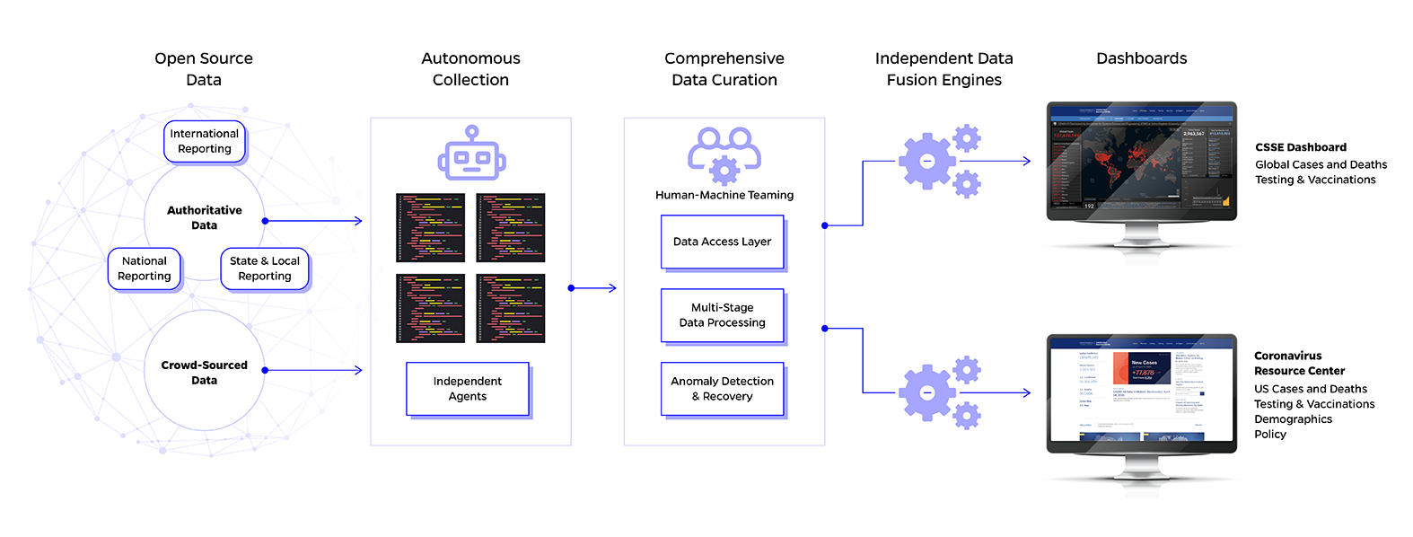
Modern web scraping is used to extract machine-ready data from places where it is being shared in a human-readable form. A program will scour web sources for specific context and extract it toward a centralized database — in this case, setting up a program to further structure it and make it available as COVID data into the dashboard. The team at APL wanted to automate collection and quality assurance processes to more quickly incorporate multiple layers of data into the repository.
Credit: Johns Hopkins APL
Ng: Our system was kind of designed with a lot of the “fail loudly” type of design paradigm. We want to fail loudly and let our team know that this stuff is failing and breaking constantly so that we can go back and immediately fix it because when it comes to web scraping, a lot of this stuff is outside of our control. If a website changes and we’re using a very brutal method — which is something that we probably want in this type of project — we actually want to know when a site has changed and it breaks something so we’re not actively collecting the wrong data. But then when it comes to our data pipeline side, we want it to be as resilient as possible.
One of the recurring principles throughout this project and pandemic was just being flexible in general. I think there are a lot of lessons learned in terms of being flexible because we didn’t know what was going to happen and what was coming next.
Beatrice Garcia, software developer: One of the recurring principles throughout this project and pandemic was just being flexible in general. I think there are a lot of lessons learned in terms of being flexible because we didn’t know what was going to happen and what was coming next.
For example, I didn’t even know that “probable cases” was a thing in epidemiology. I have a computer science degree! Things like probable cases and probable deaths were a whole new concept for me. So being able to adapt to those kinds of new requirements or new details that pop up was one of the biggest engineering problems we came across.
Even with automated methods, the team had to be cognizant of the quality of the data being pulled into the dashboard. They set the system up to clean and examine the data to make doubly sure that it was accurate. By March, the COVID dashboard was popping up in the national news, frequently cited by media and getting 60 million hits daily. The pressure to make sure the system was working properly and gathering accurate information weighed on them.
Goyea: I think, for me, it unnerved me — we [had] to really make sure what we [did was] correct.
Katz: Can we catch those errors before they propagate to the public? That was our question. This is a highly visible project where we have the press, and where we have people who are using this data to make decisions in their own homes, relying on what we’re providing. We had to get this right.
Ng: A lot of the stuff that kind of gets thrown under the rug is just how many engineering problems we ran into: working with a library full of faults, finding the right hardware, finding the right infrastructure to set up, being able to actively communicate a lot of the stuff that we do with the JHU team at the same time.
Credit: Johns Hopkins University Coronavirus Resource Center
The team lived and breathed the COVID dashboard. As the pandemic ebbed and flowed, seemingly decreasing in severity over the warm summer months, it’s logical to think the frenetic pace that characterized most of 2020 might slow. The infrastructure and data pipeline had been stood up, but this wasn’t a “set it and forget it” sort of project.
Goyea: We do have to maintain this pipeline, because things do continue to change. And now with the release of COVID vaccines, there are even further data points to add to the now fully comprehensive dashboard.
Even though our system is up, is robust and scalable, and is doing the things that we need it to do, we still have to maintain that system and continue to collect and report data. We’re also providing support for the visual analytics and helping the JHU team gain insight from the data.
The fact that it just looks like a file out on GitHub is because we’re really, really good at what we do
Katz: We’re collecting 18,000 — and soon to be a lot more — raw data points every half hour that get fused to create the hourly update on roughly 4,000 locations on the dashboard. And we collect a bigger and more diverse set of data that supports tracking and analysis on the CRC. I mean, that’s a massive undertaking.
This is a constantly evolving thing because of the nature of the problem we’re trying to solve, which I think is why it’s such a huge nontrivial enterprise. The fact that it just looks like a file out on GitHub is because we’re really, really good at what we do. That file has been updated every day and remains stable and everybody uses it, even though we’ve gone through four, maybe five generations of this architecture and infrastructure in the background. And that’s a testament to all of us on this engineering team, that’s a testament to Ryan, that’s a testament to Beatrice, that’s a testament to Tim, that’s a testament to all the folks that have worked on this project.
Now, just over a year after they stood up the first iteration of the COVID dashboard, the team has reflected on some on the whirlwind of work and development they lived through. The Coronavirus Resource Center continues to remain a trusted source for users worldwide and has been recognized nationally and globally for its contributions. The dashboard was named one of Time Magazine’s Best Inventions of 2020, and the CRC recently received the “Meeting the Moment for Public Health” award from Research!America.
Katz and his team have also gained new notoriety as disease surveillance experts among their teammates and family members.
Credit: Johns Hopkins APL
Goyea: It is really remarkable to see what you’re doing have such a huge impact. I’m extremely proud of the team. I wish I could give them something to really demonstrate how excited, impressed and proud I am of everything that they’re doing and have done.
Garcia: I guess everybody expected me to suddenly turn into an epidemiologist because every time I talked to my mom, she just kept asking when this is going to be over. And I tell her that I really only work with, you know, the data collection portion of it. But it’s still kind of funny when my parents ask me, “How’s Maryland doing? Is it going to be over soon?”
Goyea: My family is from Texas, and I swear, every week, “How’s Texas doing? What’s going on, what are the numbers?” I think we all probably experienced that from our families.
Lau: It’s pretty cool to see your product — that you’ve been working on for the past six months plus — be shown on the news. All your friends and family can see it. They’re like, “Wow, this is awesome,” and share it all over social media, but it’s also stressful because you know that every little slip-up of the data that gets through can impact thousands, hundreds of thousands of people. It really kind of, in a way, helped us solidify our infrastructure as well. Once we got to a certain point where CNN reports on our data and all that, it’s like, okay, we can’t have these little slip-ups happen.
Katz: We are the Applied Physics Laboratory. Anytime you do anything at the Lab, you’re representing 7,500-plus people out to the world. In light of that, the challenge for us is that while there are people that hold themselves to high standards, we measure ourselves against “APL-hard problems” and “APL critical contributions” — those are a level above and part of the ethos of the Laboratory. To simultaneously work on something that we know is so inherently unstable but at the same time so visible, and wanting to represent the Lab in the absolute best light that we can, showcasing the spirit of APL, really drove us.
This is where APL shines. And this is what APL was able to use and leverage to have the success in this real global impact.
Since March 2020, the CRC has hosted more than 567 million visits; as of March 2021, the data itself had been accessed over 210 billion times. The site can now track real-time metrics related to cases, testing efforts, test positivity, contact tracing efforts, disparities and vaccinations.
Goyea: It really speaks to APL’s contribution and our expertise in engineering development and now even data science, because I think all three of those components were what we needed in order for us to be successful. This is where APL shines. And this is what APL was able to use and leverage to have the success in this real global impact.
Lewis: Looking back over the past year, obviously a lot of what we were doing was probably more reactive than strategic, which is not necessarily the place we love to sit in. We want to be visionary and strategic in our thinking. But that being said, I think the tide is turning. We have that ability now. We know the goal is to keep [the dashboard] up at least for another year, so now we can pivot and be more strategic and thoughtful and think about what is the long-term opportunity here. What have we learned? We’ve started to think about next-generation health surveillance systems, and that’s really where APL is pivoting. What we can learn from everything we’ve just done, how we can parlay this into a lasting, enduring capability to benefit the country, the world?