The main window being shown is the prediction model result window. It shows a map of the Korean peninsula. The GUI displays the prediction results on the screen as colored polygons.
The disease, model and prediction period are displayed in the upper right hand corner of the screen. Hovering over a prediction area on the screen will pop up a “tooltip” which contains the name of the area being predicted for and the prediction. When you click on a given polygon, a window pops up that shows the Past case counts for a given region.
Disease - The disease being predicted for this model run. Currently only malaria in Korea is supported.
Prediction Model - The name of the model used to generate the predictions.
Prediction Period - The start and end date of the window for which the predictions are valid. Presently this is a two-week period.
The predictions for Korea have three levels: low (0-2 cases), medium (3-16) and high (17 or more). The number of cases predicted is the aggregate for the two week prediction period.
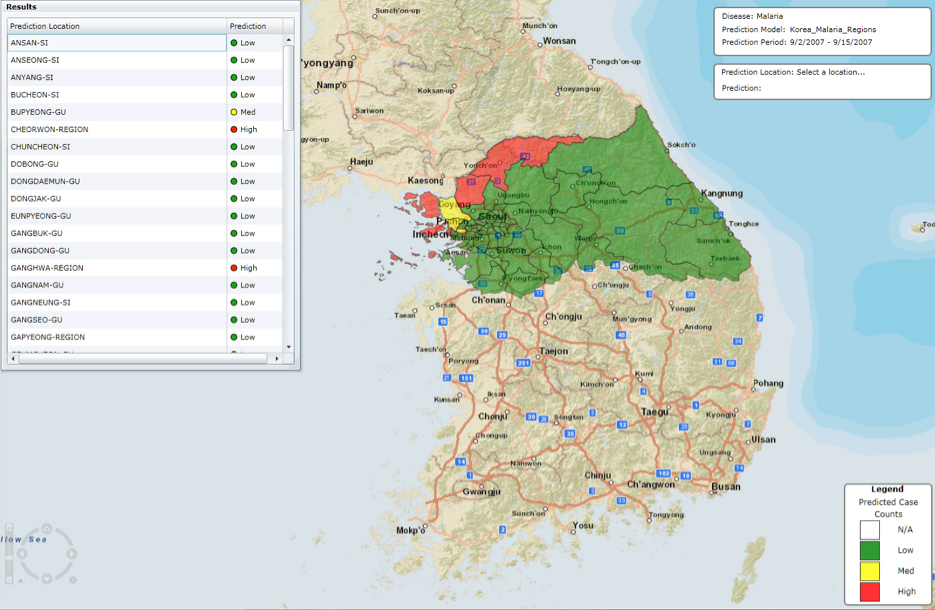
Figure 1
When you click on a given polygon, a window pops up that shows the Past Case Counts for a given region (see Figure 2).
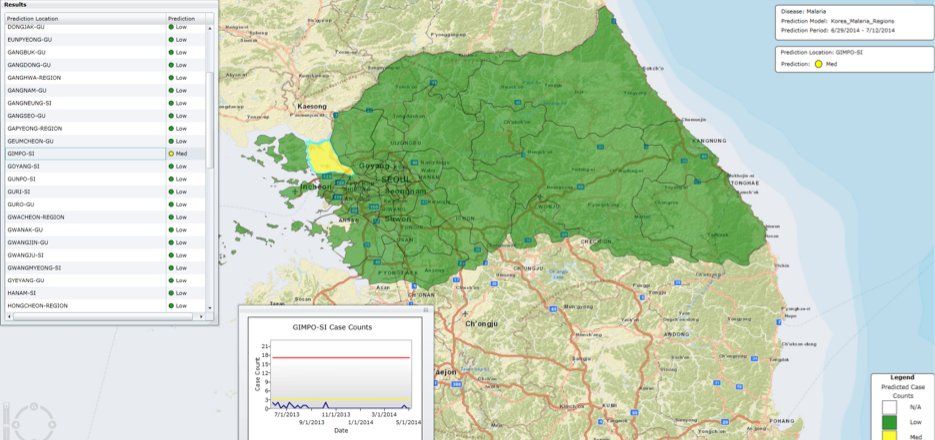
Figure 2
![]()
© 2014 The Johns Hopkins University Applied Physics Laboratory LLC. All rights reserved.